IN YOUR SPACE
Where it fits.
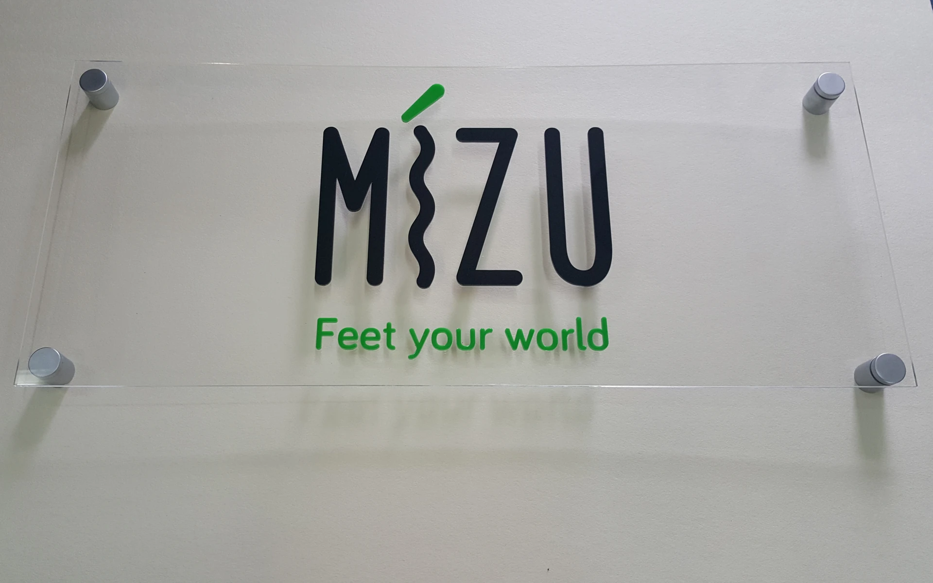
- Reception signs and panels on standoffs
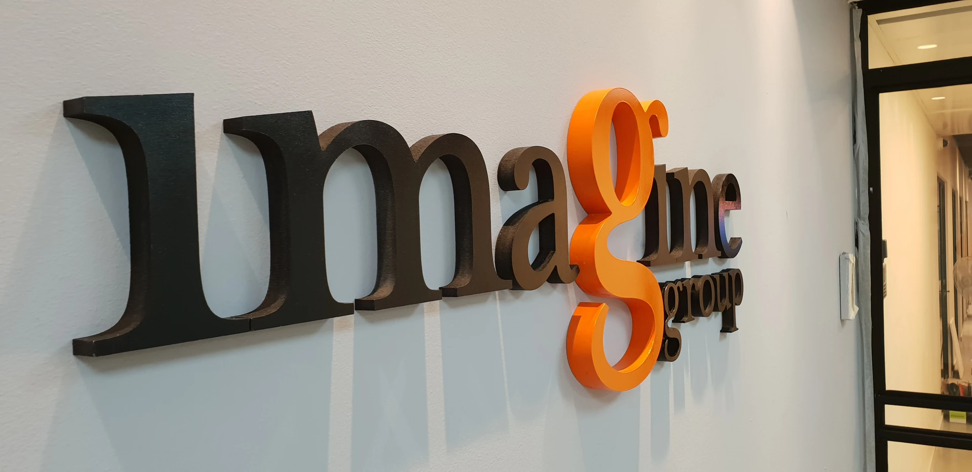
- Dimensional lettering and brand symbols
- Displays and shaped objects
Three choices that shape the result.
01
Clear, translucent or opaque
Clear material leaves the wall visible. Translucent and opaque finishes create a different presence and should be viewed in the room’s light.
02
Thickness and layers
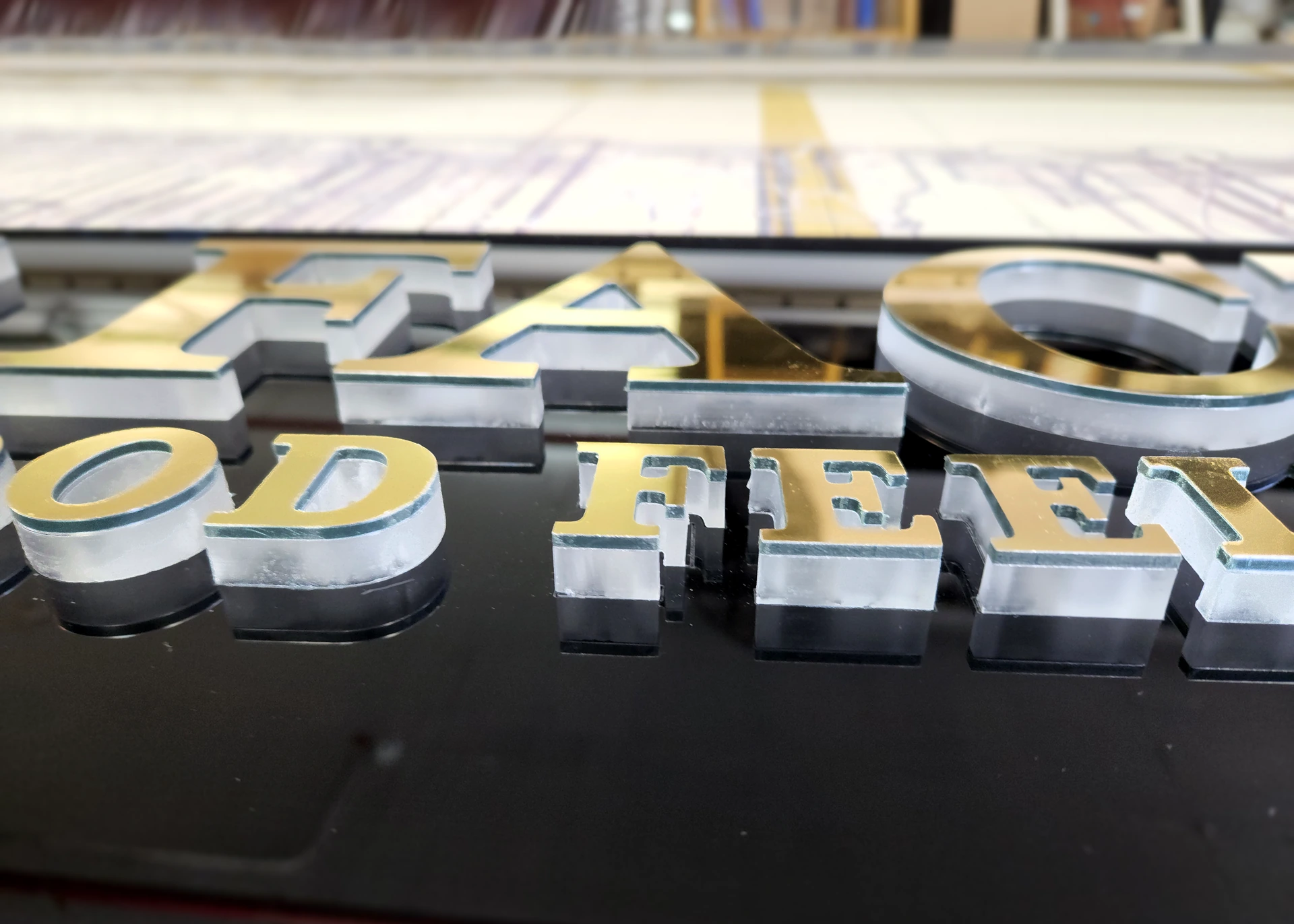
Thickness changes the letter edge, shadow and perceived depth. Layered work also requires attention to the junction between colours and materials.
03
Fixing and background
Choose flush or offset mounting to suit the design. With a clear panel, fixing positions and what remains visible behind it matter too.
BEYOND THE PHOTOGRAPH
A finish for everyday use.
Use a soft cloth and an acrylic-compatible cleaner. Consider frequent contact and the risk of scratches when selecting the location.
Before approval, review the sample, dimensions and fixing method together. The photograph illustrates the direction; the agreed specification defines your project.